
Token Symbol
All design rights of CROSS BI—including copyrights and trademarks—are owned exclusively by NEXUS Corporation. Use of design assets is allowed only with agreement to all terms in this guide. For items not covered here, please contact the relevant representative.
Download the complete CROSS Brand Guidelines and Asset Pack here.
Token Symbol
The CROSS token symbol is a key element that defines the brand’s consistent image and clearly represents its unique identity. It should be given priority across all media related to the token.
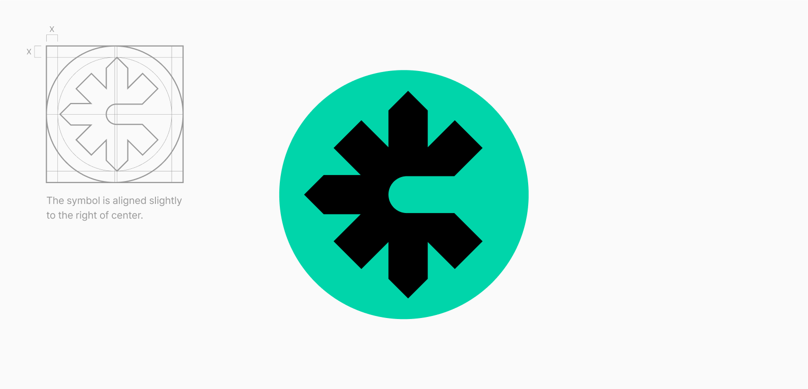
Clear Space & Minimum Size
For effective use of the CROSS BI, the token symbol must maintain minimum clear space and use a margin box for visual balance. To ensure legibility and brand recognition, apply it at or above the minimum size specified in this guide.
Color Usage
Use the Basic Color Negative version of the token symbol by default and follow the specified background guidelines. For any non-designated color combinations, consult the design team before use.
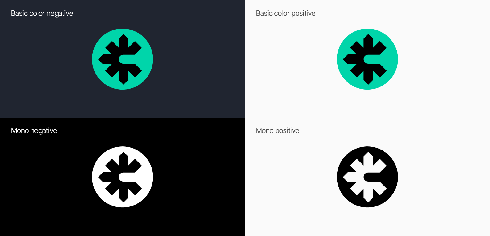
Brand Color
The brand color is a core element of CROSS’s visual identity and must be used consistently across all communications.

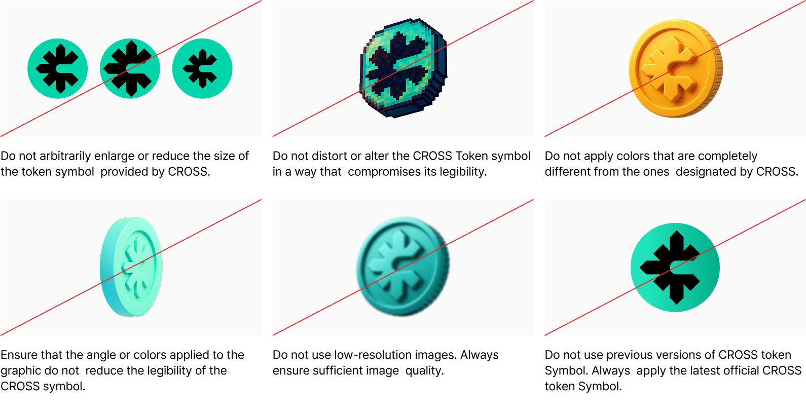
Please Don't
This guide defines the minimum restrictions for using the CROSS symbol. Regardless of the game style, the symbol must maintain its original form and legibility, and should not be distorted or arbitrarily altered.
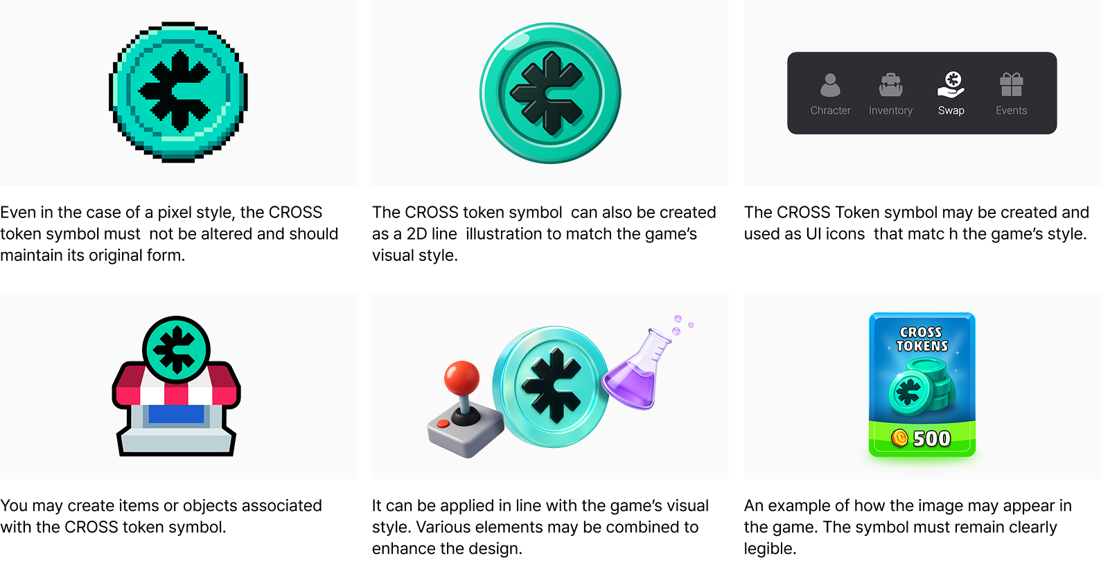
Please Do
This guide illustrates practical ways to apply the CROSS symbol across different game styles. It provides examples that show how to adapt the symbol to fit a game’s unique tone and visuals while maintaining consistency with the CROSS BI identity.
App Icon
As one of the key elements that shape the first impression of the app, the app icon is derived from the logo and must be used as provided. It is a crucial expression of CROSS’s identity and should not be modified.